An app that helps you keep up with all the events happening around you
— an overview
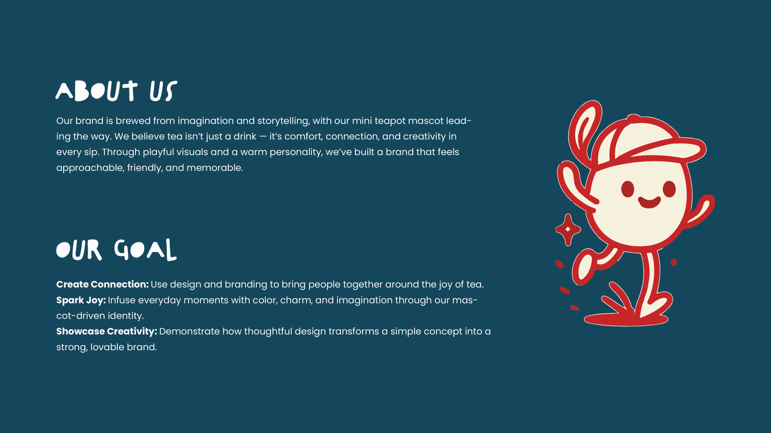
Our brand is brewed from imagination and storytelling, with our mini teapot mascot leading the way. We believe tea isn’t just a drink — it’s comfort, connection, and creativity in every sip. Through playful visuals and a warm personality, we’ve built a brand that feels approachable, friendly, and memorable.
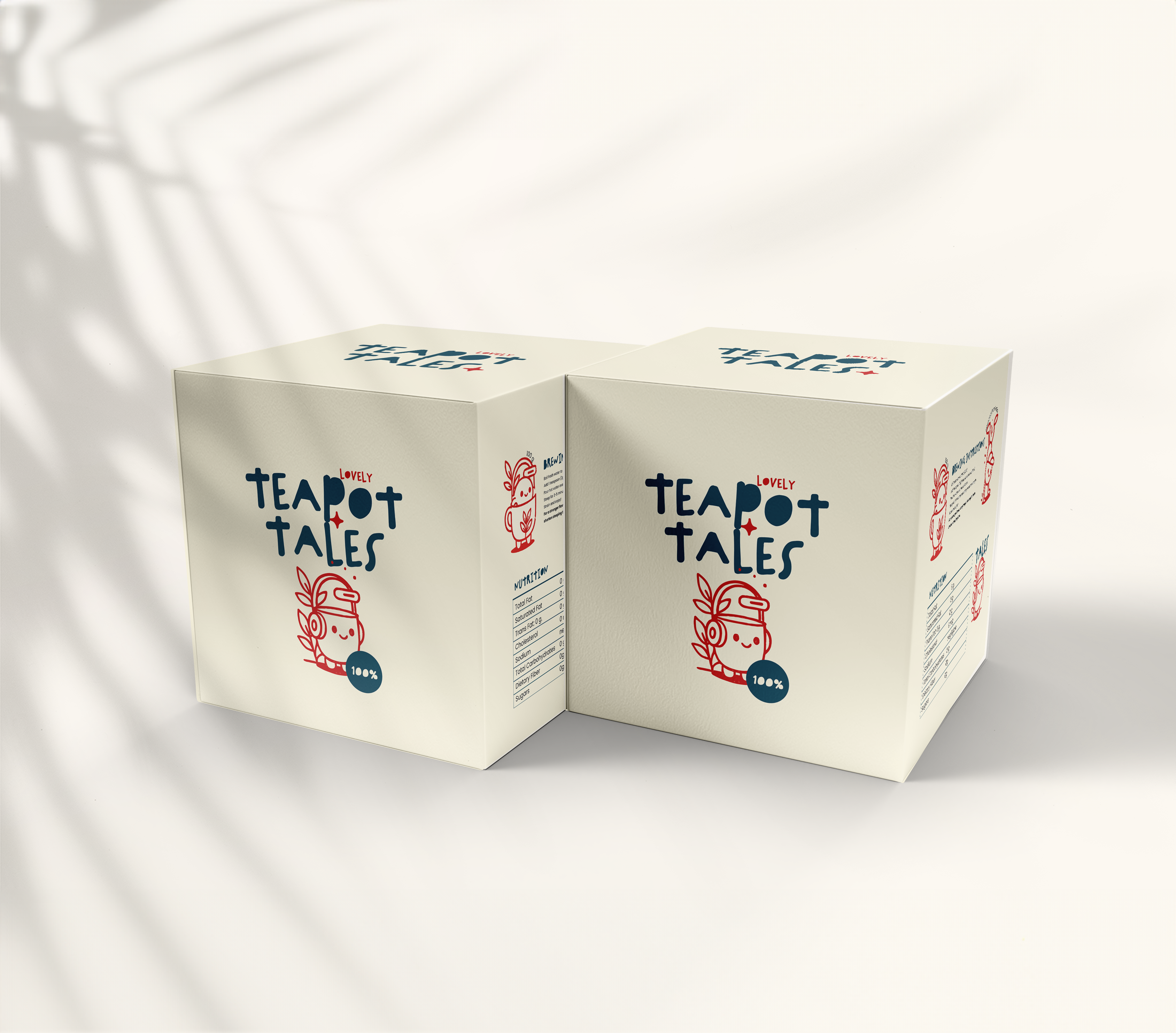
Brand Concept Development- Mascot Character Design-Visual Identity & Logo Design-Packaging & Mockup Creation
TOOLS USED
Adobe Illustrator – Mascot illustration & logo
Adobe Photoshop – Mockups & visual applications
THE PROCESS
The process is divided into six very important steps.
Gathering Insights
Clarifying the Problem
Generating Ideas
Designing Solutions
Validating with Users
Gathering Insights
User research
I began by studying how tea brands position themselves in the market. Many focus on tradition, luxury, or wellness, but very few use a playful, mascot-driven identity. Research into consumer preferences showed that audiences, especially younger ones, connect strongly with characters that bring warmth and relatability. This insight revealed a gap in the tea sector for a brand that feels both joyful and approachable while still maintaining a sense of quality.
Clarifying the Problem
The core challenge was to design a brand that would stand out in a highly competitive space, where packaging often looks similar across shelves. I needed to create an identity that communicated comfort and friendliness, while also being distinct and memorable. The problem could be summed up as: How do we turn a simple product — tea — into a lovable experience through visual storytelling?
Generating Solutions
Through sketching, moodboarding, and experimenting with different character concepts, I explored how a mascot could bring the brand’s personality to life. The mini teapot character emerged as the perfect symbol: small, warm, and expressive, capable of carrying emotion and charm across touchpoints. I developed a color palette inspired by soothing tones mixed with pops of cheerful hues, ensuring the brand could strike a balance between cozy and playful. Typography and packaging structures were also considered, keeping in mind how they would complement the mascot’s presence.